| modified | Thursday 29 December 2022 |
|---|
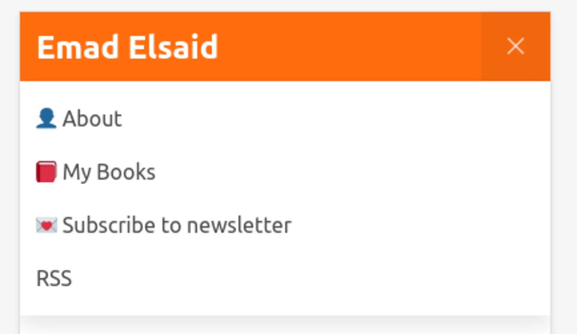
Today I liked the Navigation bar design for Linux.com and I wanted to implement it for my blog. While doing so I remembered that bulma navigation bar will collapse the menu and show burger menu on mobile when clicked it shows the menu. The proposed solution on bulma website uses javascript. I had a principle on this blog not to introduce a single line of Javascript and I want to keep it this way. So here is how I did it with only CSS.
- I added a checkbox called
menu-switchbetweennavbar-brandandnavbar-menu - In
navbar-brandI replaced the burger menuatag withlabeltag that toggles the checkbox. - CSS is added to select any
navbar-menuthat comes after a checked checkbox calledmenu-swtich. and hide the checkbox itself
Now clicking the burger menu will toggle the checkbox and the menu will be shown if the checkbox is checked.
 1  <nav class="navbar" role="navigation" aria-label="main navigation">
 2      <div class="navbar-brand">
 3        <a class="navbar-item" href="/">Site name</a>
 4        <label for="menu-switch" class="navbar-burger" role="button" aria-expanded="false">
 5          <span aria-hidden="true"></span>
 6          <span aria-hidden="true"></span>
 7          <span aria-hidden="true"></span>
 8        </label>
 9      </div>
10
11      <input id="menu-switch" name="menu-switch" type="checkbox"/>
12
13      <div class="navbar-menu">
14        <div class="navbar-end">
15          <a href="/" class="navbar-item">Link1</a>
16          <a href="/" class="navbar-item">Link2</a>
17          <a href="/" class="navbar-item">Link3</a>
18        </div>
19      </div>
20  </nav>
1#menu-switch {
2 display: none;
3}
4#menu-switch:checked + .navbar-menu{
5 display: block;
6}
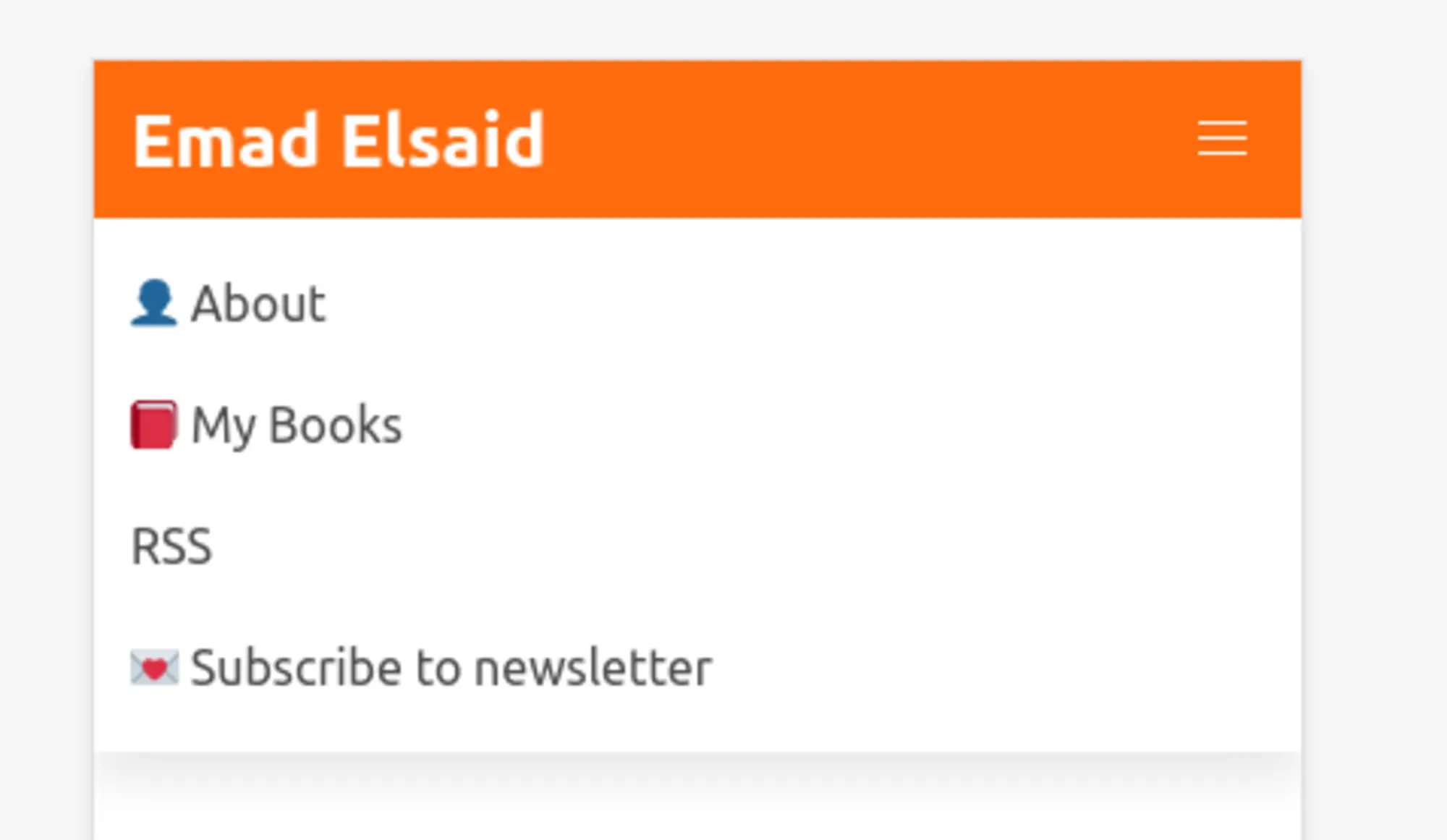
This solution partially solved my problem. it’s missing one piece. In the original Javascript solution the navbar-burger gets a class is-active which changes the 3 lines to X sign. unfortunately I didn’t find a suitable CSS selector to select the navbar-burger that comes in navbar-brand before a checked menu-switch. and even if the selector exists I still need to replicate all the CSS that applies on the span tags inside the burger menu to change them into an X.
So this solution is good enough. and you can find it in action if you’re on a small screen on this page.
Update 
After showing Jeremy Thomas the creator of Bulma this solution he suggested changes that solves the burger menu transformation to X
Move the menu switch before the brand tag
 1  <nav class="navbar" role="navigation" aria-label="main navigation">
 2      <input id="menu-switch" name="menu-switch" type="checkbox"/>
 3
 4      <div class="navbar-brand">
 5        <a class="navbar-item" href="/">Site name</a>
 6        <label for="menu-switch" class="navbar-burger" role="button" aria-expanded="false">
 7          <span aria-hidden="true"></span>
 8          <span aria-hidden="true"></span>
 9          <span aria-hidden="true"></span>
10        </label>
11      </div>
12
13      <div class="navbar-menu">
14        <div class="navbar-end">
15          <a href="/" class="navbar-item">Link1</a>
16          <a href="/" class="navbar-item">Link2</a>
17          <a href="/" class="navbar-item">Link3</a>
18        </div>
19      </div>
20  </nav>
And select the menu with ~ instead of + and apply the transformation to the burger button lines
 1#menu-switch {
 2 display: none;
 3}
 4#menu-switch:checked + .navbar-brand .navbar-burger span:nth-child(1) {
 5  transform: translateY(5px) rotate(45deg);
 6}
 7#menu-switch:checked + .navbar-brand .navbar-burger span:nth-child(2) {
 8  opacity: 0;
 9}
10#menu-switch:checked + .navbar-brand .navbar-burger span:nth-child(3) {
11  transform: translateY(-5px) rotate(-45deg);
12}
13#menu-switch:checked ~ .navbar-menu{
14 display: block;
15}
This solves the button transformation as you see in this screenshot